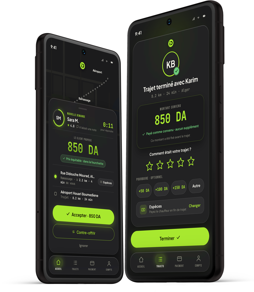

MOBILITY UX — REDESIGN CONCEPT
INDRIVE
The fair-price ride app, rebuilt as one dual-theme system — light and dark designed together, French-first for the Algerian market, with the brand’s lime pushed into a real identity.
- ROLE
- UX / UI — full concept
- TOOLS
- Figma · Design tokens
- SCOPE
- 2 themes · full trip cycle
- UI LANGUAGE
- Français
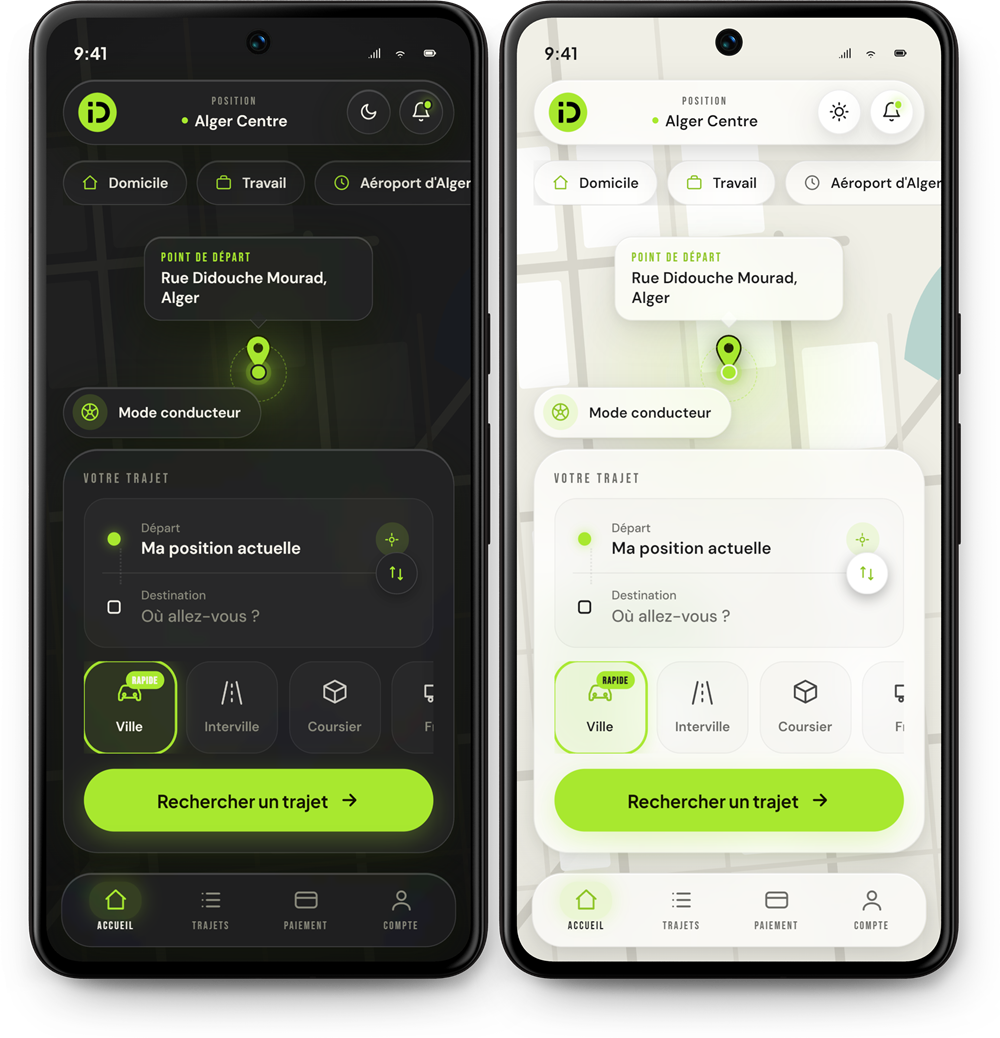
( 01 )
Splash, login & signup
A confident dark entry sequence — three screens from install to first ride request.
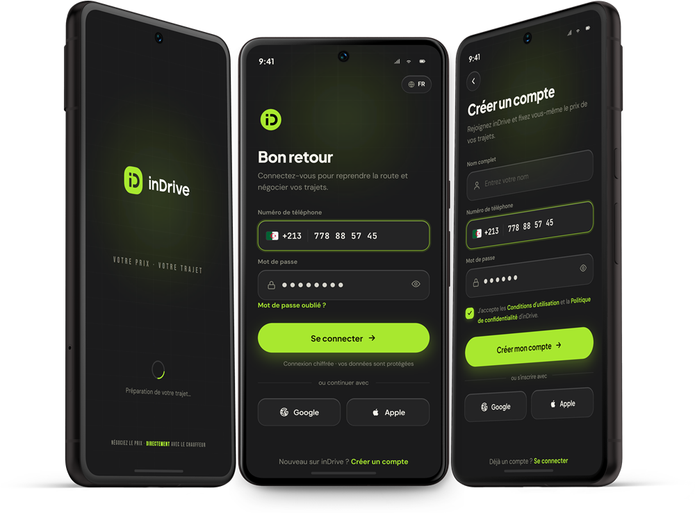
( 02 )
One home, two themes
The same screen designed twice from the same tokens — not a dark filter over a light app.
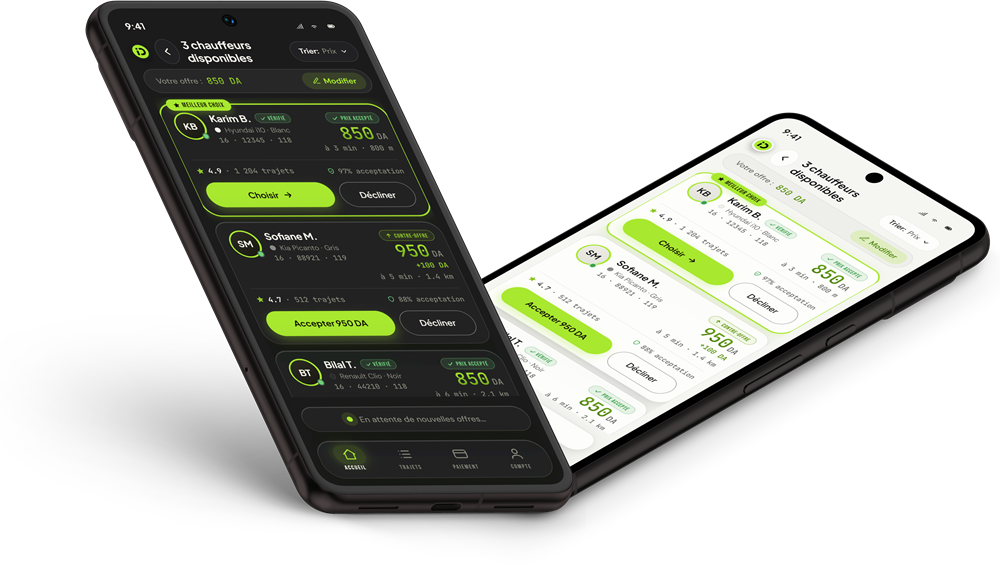
( 03 )
Choosing your driver
Offers as scannable cards — price, rating, car, ETA — the negotiation that makes inDrive, made legible.
( 04 )
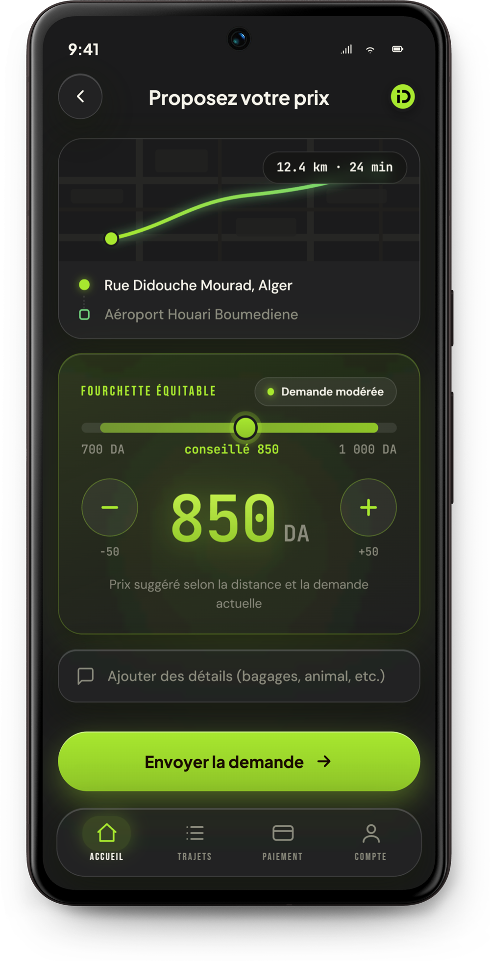
Fare negotiation
Your price, their counter — a bidding surface that feels like a conversation, not a slot machine.
( 05 )
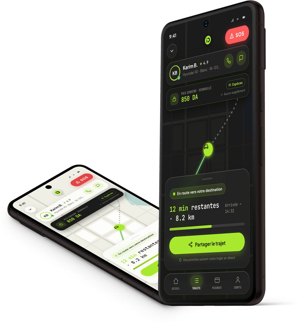
Live trip
Route, driver and safety actions pinned where thumbs live — in both themes.
( 06 )
Trip complete
Payment, rating and rebooking in one closing screen that ends the ride on a high.